
A sign is one of the most important elements of outdoor advertising. It should be noticeable and easy to read from a distance to attract the attention of potential customers.
Letter size
The letter size determines how far your message can be read. Letters that are too small or too large will affect the quality of your sign, so it’s important to know what letter height works best for a given viewing distance.
The general principle is that the height of the letter should be at least 1/10 of the distance from which it can be read. For example, if you want your sign to be read from a distance of 50 meters, the height of the letter should be at least 5 meters.
However, this principle is only indicative. The actual size of the letter is affected by the following factors:
• Slope of the surface on which the sign is placed. If the sign is placed on a vertical surface, the height of the letter may be slightly smaller than in the case of a horizontal surface.
• Visibility. If the sign is placed in a place with limited visibility, then the height of the letter should be greater than in the case of a place with open space.
• Lighting. In the case of bright lighting, the height of the letter may be slightly less than in the case of poor lighting.
Font color

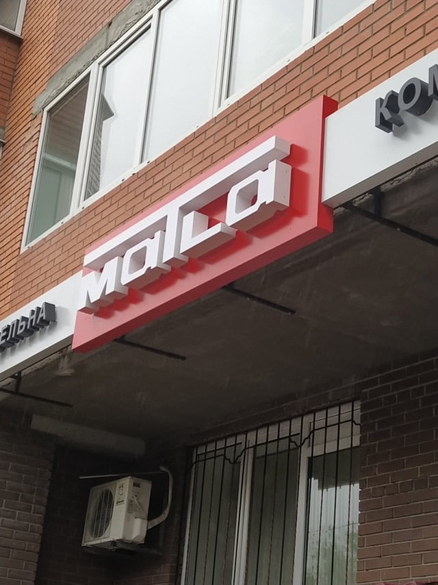
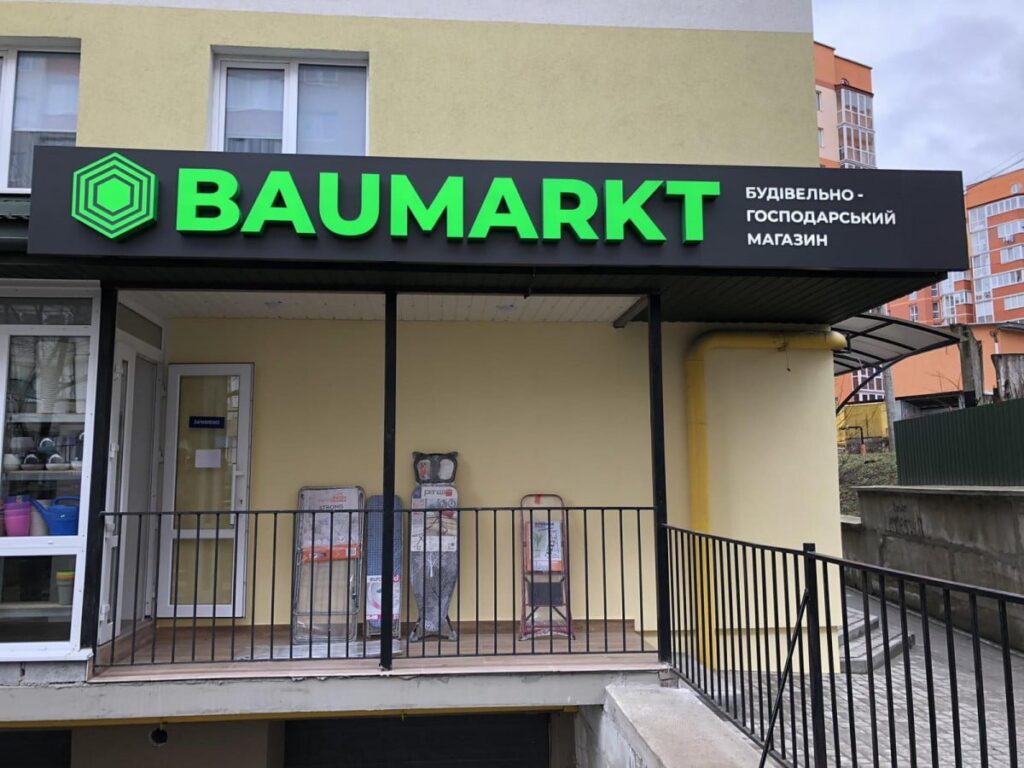
For better visibility of the letters, use colors that contrast with the background color of your sign. The general rule is that you should use a light background with dark letters and vice versa. A dark background with dark letters will not stand out.
However, when choosing the color of the text, you should consider not only the contrast, but also other factors, such as:
• Psychological impact. Certain colors can evoke certain emotions or associations. For example, the color red is associated with energy and dynamism, while the color blue is associated with calmness and pacification.
• Brand fit. The font color should match the overall style of your brand.
Other factors
In addition to letter size and color, the following factors also affect the visibility of the sign:
• Font type. Serif fonts tend to be harder to read from a distance than sans serif fonts.
• Form of letters. Letters with a simple outline are generally easier to read than letters with a complex outline.
• Placing a sign. A sign that is placed in a prominent place will be more noticeable than a sign that is placed in a corner.
Final recommendations
For a sign to be effective, it must be visible and easy to read from a distance. Factors such as distance from which the sign will be perceived, visibility, psychological impact, brand fit, and other factors should be considered when choosing size and color.
Contact us for a consultation
If you want your advertising to give maximum results, leave a request on the website. Also, follow us on social networks, there is a lot of useful stuff there!